
|
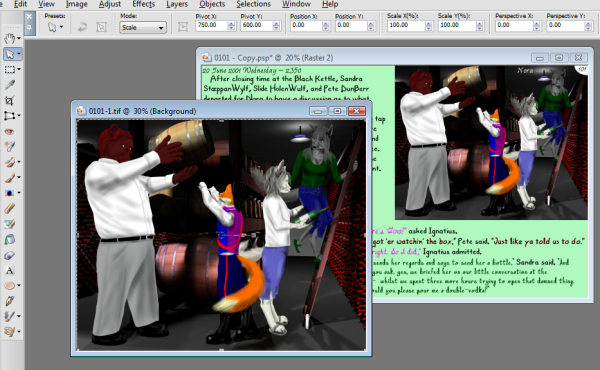
Below, I describe how I make the web-comicpage pages. This includes the artwork, the lettering and layout. This is a very basic overview and should not be considered a "how-to" but more of a "why this way?" There are four basic steps: 1st - Decide what will be drawn for the page based on the text. 2nd - Arrange the lettering and layout 3rd - Render the scenes using Blender 4th - Draw the characters These are NOT straightforward steps. I frequently go back and forth with the steps. For example, after rendering, I might decide the picture is too small, so I re-arrange the lettering to accomodate a bigger picture. Okay, let's look at the first step. First, I'll copy and paste the text into my drawing. I use an old version of Corel's PaintShopPro X to accomplish this as I managed to get a legitimate copy for about $US 8 on ebay (I even registered it). The interface for text is easy to use and flexible. I also change the page number (d'uh) and I either delete or edit the header that gives the place and time. You may have noticed that, up until recently, I had a header at the top of each drawing that gave the time, date and setting. Now, I only place it there when the scene actually changes. I promised myself that I would never go back and change drawings, but I might actually go back and redo the earlier pages, just because it's so easy to do. Like I have nothing better to do with my time... 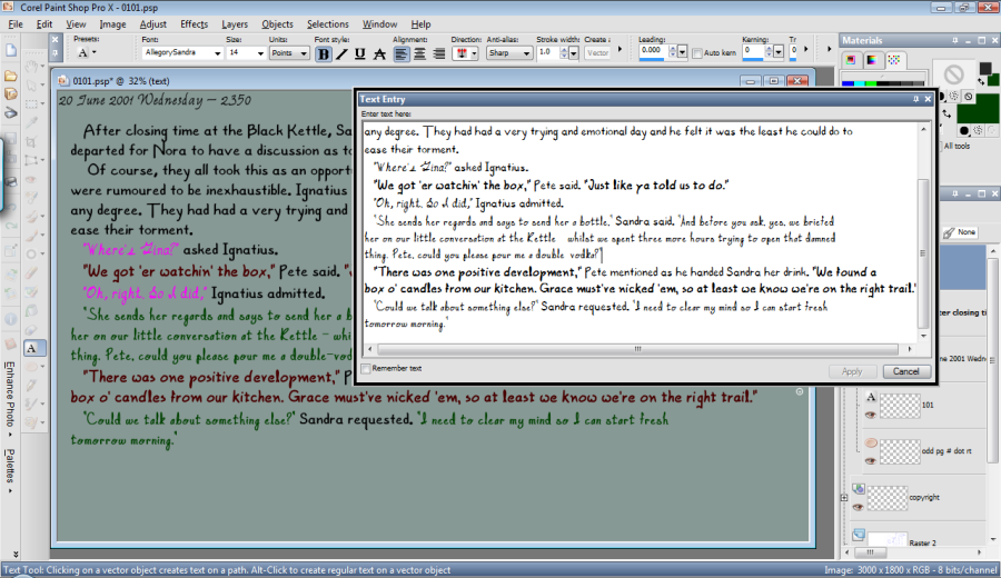
I hope you've noticed by now that all of the characters have their own font. Not only that, but they have their own color. So, for anything that's in quotes, I change it to that character's font and color. My thinking behind this is that it would help the reader keep track of who was speaking. When you see lavender (or is it magenta?), you know it's Ignatius. Of course, everything outside of a quote, I use the AllegoryNarr font (which I will make either black or white, depending on what shows up better). The downside to this is that choosing a background color that gives good contrast to all of the different colors can be a bit tricky and on some pages, you can see that I use gradients or patterns. And if I can't get a good background color, I have to use those dreadful clouds behind the words. One of the nice things about PaintShopPro is that it allows me to save Ig's font and color and size as a preset style. So, whenever Ignatius is speaking, I just have to use that style and not adjust all three things. I always put in more text than I will actually use, because it's easier to delete text than to add it. Next comes the hardest part and that is deciding what I will actually draw. Over time I have developed some guidelines that help me: Guideline 1 - I try to limit the drawing of detailed characters to two per page. Of course, some characters are super-simple to draw (like Pete) and others take a good bit longer (e.g., Linda). Guideline 2 - I try to limit 'talking heads'. I really, really try to put some imagination into the drawings, instead of just showing basic expressions. Guideline 3 - If I can't come up with anything inspired that meets Guideline 2 within one day, then I'll cave and do 'talking heads'. Sometimes you just have to push on. 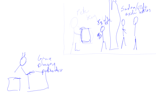
Okay, so let's say I come up with an idea. On this page, I thought it would be nice to show off Nora's cellar, with everyone helping themselves to some free drink, while Gina is playing solitaire or reading in the basement of The tre'. So, I make an extremely rough drawing - typically just stick figures and a note or two - which will dictate the size and location of the drawings. And when I say 'rough', I mean rough. Then I move the text around to accomodate the pictures. That gives me a very accurate measurement of precisely how big my pictures can be. 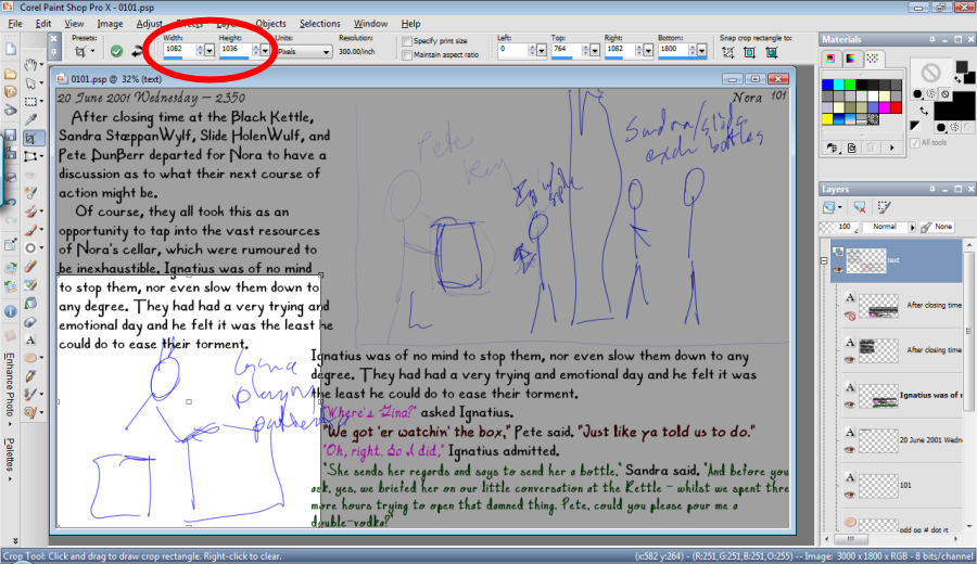
I actually use the crop tool to measure. The highlighted area in the rough picture is the area I'm measuring and the dimensions are thoughtfully provided as shown in the red circle. Gina's picture, of course, came out a little smaller to fit within the text. It's pretty common for me to monkey around with several scenarios and layouts, so this is one of those times when I go back and forth between steps. Now, that I've decided on what I'm going to draw - which, for me, is the hardest part - I can get to work on actually making pictures. All's fair in love and war. And as far as I'm concerned, 'art' can be added to that list as well. I cheat like hell. I can draw all of my characters without any sort of aids (and have done so), but my method helps me keep them consistent and makes things much faster. I use Blender for all of my computer renderings. By the way, Blender is available free of charge at www.blender.org. I should warn you that there's a pretty steep learning curve. I build all of my own 3-D models for everything; the characters (I also have to give them an armature or 'skeleton', so I can move their body parts), the buildings, the furniture, trees, roads, spoons and so on. I confess that, in a hurry, I once downloaded a model of a toilet that I used for one scene. 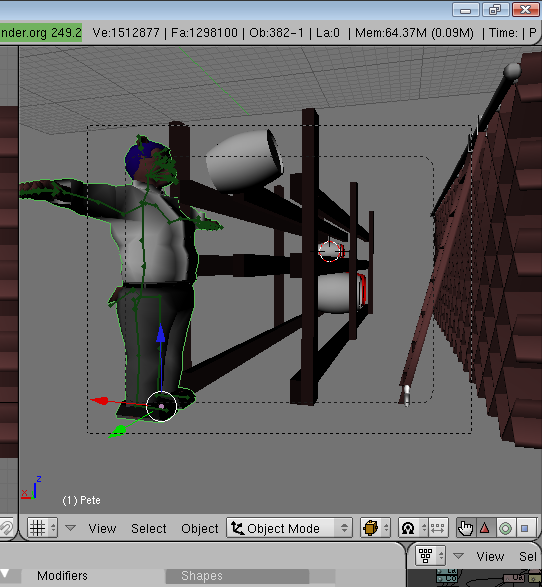
So, here we see me setting up my scene in the basement of Nora, and I've stuck Pete in. His arms are stuck out because I haven't used his armature to pose him just yet and that's his default pose. This is just the very beginning of creating the scene. 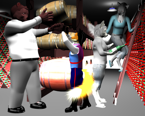
Next, I insert the remaining characters, pose them, maybe add a prop or two, and then render. What's really, really great about this is I can fiddle around with the lighting and camera angles and get everything 'just so'. Notice that there are no shadows on this rough render? If there were any glass, it would be opaque. Because these details aren't generated, the picture can be rendered quite quickly - typically less than a minute. So, I can piddle around and experiment and change details easily and quickly and then take another test render. I might take anywhere from a few renders to dozens before I get what I like. The whole process, however, can easily take several hours. 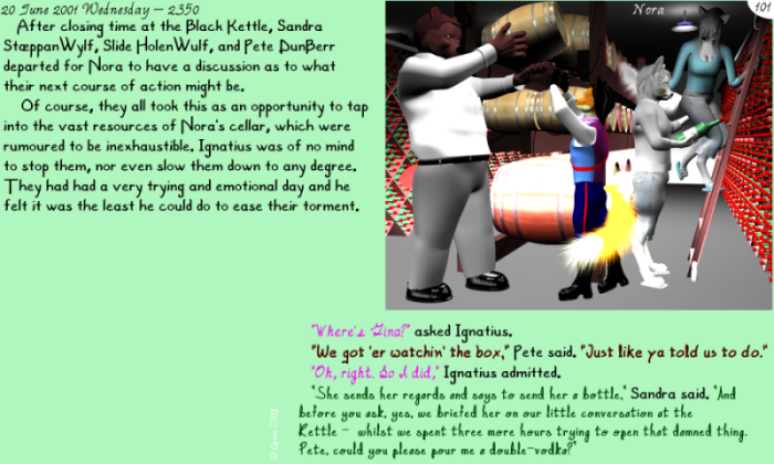
Just as a precaution, I'll stick the rough render into the main page drawing to see if it 'fits'. Look okay? Moving on... 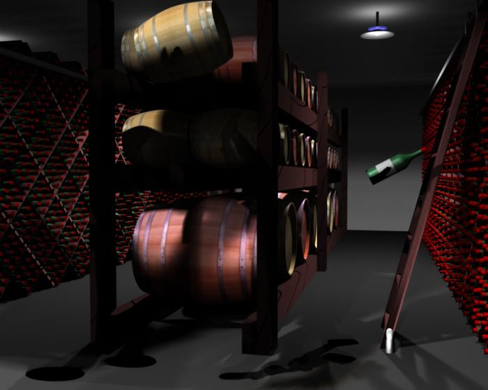
Now I'll render the background and props with the characters being invisible, but still casting a shadow. To do this, I have to use a technique called ray-tracing and this will substantially add to the rendering time. A picture like this can easily take several hours. 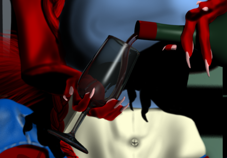
Now I'll start drawing the characters. For this particular drawing, it was fairly simple as no clear glass - such as mugs or spectacles - are involved. Slide has specs, but they're barely visible so not an issue and I made the bottles have opaque glass. If there is glass (say a mug) and a character is behind, then how do I draw that? Well, I don't. If you see a wine glass, the parts of the character behind it are actually rendered and not drawn by me. Here's an example with Linda. Look carefully at what's behind the wine glass. It's a little dark, but behind the glass you can see: - some of her shirt, - the heel of her hand and - the shadow that her other hand casts on her shirt. She's got some meathooks for fingernails, doesn't she? About time for a manicure, I think. Anyway, whenever you see a glass of wine or a mug of beer, what's behind it is probably rendered. The exception is spectacles, which I will draw. Okay, moving along, my next step is to draw the characters in the scene. Now, in this particular scene we have four characters: Pete, Ignatius, Slide and Sandra. What I will do is draw the characters individually and insert them into the scene and then insert the finished scene into the main page. If it was just one or two characters, I would just draw them all on the same file, but with four, it becomes too unwieldy. Okay, here's where the real cheating comes in. I'll start with Sandra. I'll take Sandra's rough and draw blue lines on a separate layer. 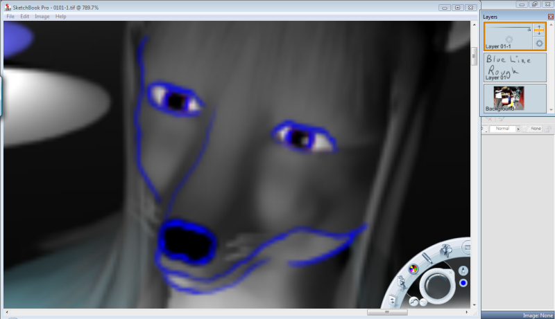
At this stage, I'm using a different art program called SketchBook Pro. "Why change from PaintShopPro?" I hear you ask? Because Sketchbook Pro, although limited in many regards is designed for tablet PCs. In general, I use no paper, pencils, ink or scanners in my production. Everything is digitally drawn using a tablet PC with a 14" screen (It is a Gateway C-140X, if you're interested). Using drop-menus with a stylus is a royal pain and Sketchbook Pro uses a 'tap and flick' interface that is MUCH easier for a tablet PC to deal with and is very fast. Also, the tablet PC is pressure sensitive and Sketchbook Pro uses that aspect very well. So, for the actual *drawing* part, I use Sketchbook Pro. PaintShop Pro is used for lettering and layout. I'll then trace all of the other characters and it'll look something like this: 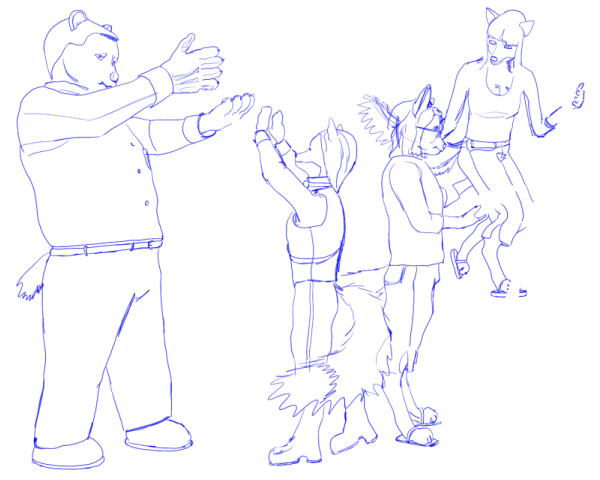
The blue lines are on top of a transparent background. That means that I can draw under the blue lines without affecting them. 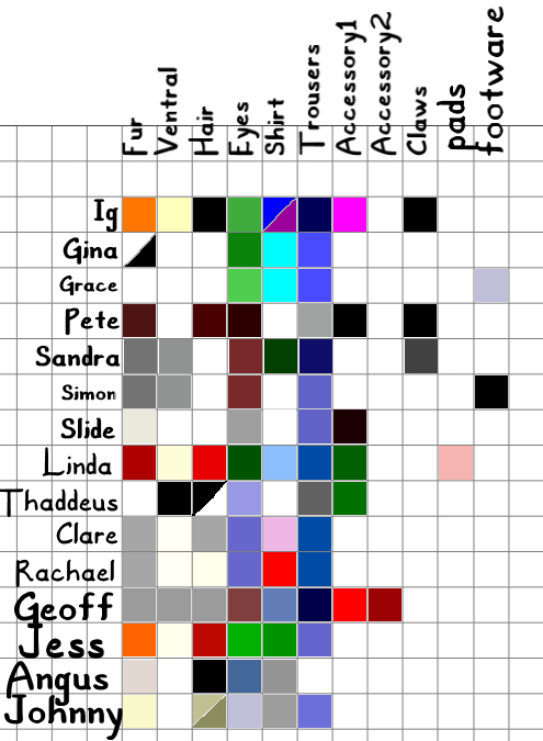
So, first, I'll start with basic colors. Something I learned very quickly was that I needed a color guide. It looks like this. Now, it's easy to keep my colors consistent. So, using that and my blueline trace, I draw on the layers underneath to get a basic shape like this (for Sandra): 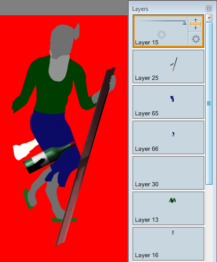
I want to draw your attention to a few things: On the right are the many layers that I draw on. If you're unfamiliar with the concept, a layer is like drawing on a sheet of clear plastic. If you have several layers of plastic, you can 'stack' them, one on top of the other. That makes drawing a lot easier. If you look closely, you can see that her shirt is on layer 13 and her right trouser leg is on layer 65, which is *above* layer 13. So, as in the real world, the waistband of her trousers is above the tail of her shirt and covers it. Neat, no? Second, notice that the bottle and the *right* side of the ladder are rendered and are in layer 25, near the top. I actually go into Blender, remove everything except those parts (although I leave the invisible characters that cast shadows) and render those little bits. Why? Because that allows me to draw on layers that are under (and over) them. That way, I don't have to erase the part of Sandra's foot that is behind the ladder. It is covered by the ladder on a separate layer. I used to do the erasing in the past. It's a pain. Also, it's nearly impossible to see, but Sandra's left fingers are on layer 15 above the ladder. That's Slide's hand on her ass (arse) by the way. Just in case you were wondering. 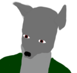
Now we go into some details. Once again, using my color chart and the blue line, I draw some basic features like eyes and nose. If the mouth is open I draw that as well (but no mouth here). 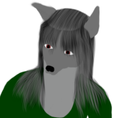
Then I'll draw the hair. I use a special 'brush' to do this. Basically, the equivalent would be to take a bunch of pencils and tie them together with a rubber band. It's that simple.I use a solid base, the color of Sandra's dark fur and then use darker highlights with my special (*ahem*) hair brush. Notice that the hair is drawn in a layer over her eyes, as in the real world. I also have to draw some of the hair on a new layer behind her head. That hair gets everywhere. But at least it's relatively straight so quick and straightforward, unlike Simon and Slide - their hair takes forever to draw. Oh, and Linda - don't *even* get me started. Am I starting to sound like a hair-dresser? 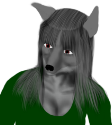 I guess it's time to talk about cleavage. Sandra's chest and face are on the same layer. I draw
the shadows that form her cleavage and detailed facial features (including her closed mouth) on a layer
just above that. I use a simple airbrush
and hard and soft erasers. This shadowing is *underneath* the 'eyes and nose' layer. And the shirt, of course.
This is where I frequently refer to the renderings for some visual assistance.
I guess it's time to talk about cleavage. Sandra's chest and face are on the same layer. I draw
the shadows that form her cleavage and detailed facial features (including her closed mouth) on a layer
just above that. I use a simple airbrush
and hard and soft erasers. This shadowing is *underneath* the 'eyes and nose' layer. And the shirt, of course.
This is where I frequently refer to the renderings for some visual assistance.
 The shading to form the face and cleavage is surrounded by other parts, such as her hair and shirt.
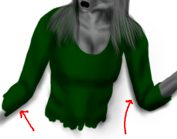
Unfortunately, when it comes to shading her shirt, there will be overspray (as pointed out
by the cheesy red arrows). One of the downsides to Sketchbook Pro
is that it has limited features (ostensibly to prevent a cluttered interface). There's a feature called 'burn' - which
darkens a color. There's also one called 'mask', which basically acts as a stencil. Sketchbook Pro has neither
of these and it makes my drawing more difficult. Are you reading this AutoDesk! Get on the stick!
The shading to form the face and cleavage is surrounded by other parts, such as her hair and shirt.
Unfortunately, when it comes to shading her shirt, there will be overspray (as pointed out
by the cheesy red arrows). One of the downsides to Sketchbook Pro
is that it has limited features (ostensibly to prevent a cluttered interface). There's a feature called 'burn' - which
darkens a color. There's also one called 'mask', which basically acts as a stencil. Sketchbook Pro has neither
of these and it makes my drawing more difficult. Are you reading this AutoDesk! Get on the stick!
So, how to fix this? Well, I merge the shading and the base color into a single layer and then trim off the overspray with a hard eraser. Five minutes worth of work. Meh. 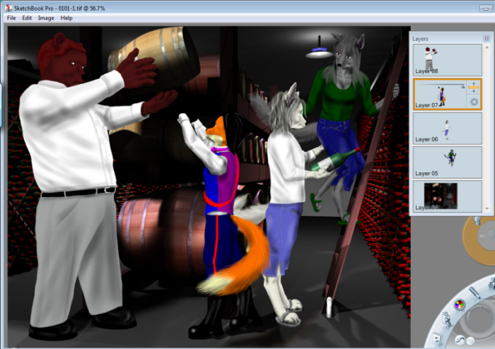 Once Sandra is done, I'll draw the other characters in separate files. If I try to draw four characters in a single file,
I end up with a hundred layers and my machine crashes. To finish this picture, I open my ray-traced rendering I
did earlier (the one with all the nice shadows that took hours). Then I insert Sandra, Slide, Ignatius and Pete all on
separate layers.
When I insert her, the drawing of Sandra is one layer. However, the file that has a drawing of *just* Sandra
still retains the original layers.
Once Sandra is done, I'll draw the other characters in separate files. If I try to draw four characters in a single file,
I end up with a hundred layers and my machine crashes. To finish this picture, I open my ray-traced rendering I
did earlier (the one with all the nice shadows that took hours). Then I insert Sandra, Slide, Ignatius and Pete all on
separate layers.
When I insert her, the drawing of Sandra is one layer. However, the file that has a drawing of *just* Sandra
still retains the original layers.
So, back to PaintShop Pro. Finally I can stick my finished picture into the page as a separate layer. As before, the inserted drawing is recognized only as a single layer, even though it has five layers. What's very important (I learned early on) is that once I 'copy' my multilayer file, I should close it immediately *without* saving it. PaintShop Pro does NOT recognize the multiple layers from Sketchbook Pro and if I save my drawing, it collapses all of the layers (which would make it difficult to correct any errors, which I occasionally find at the last minute). |
Please respect my copyleft when downloading any content.